
Comments on drafts, redesigned
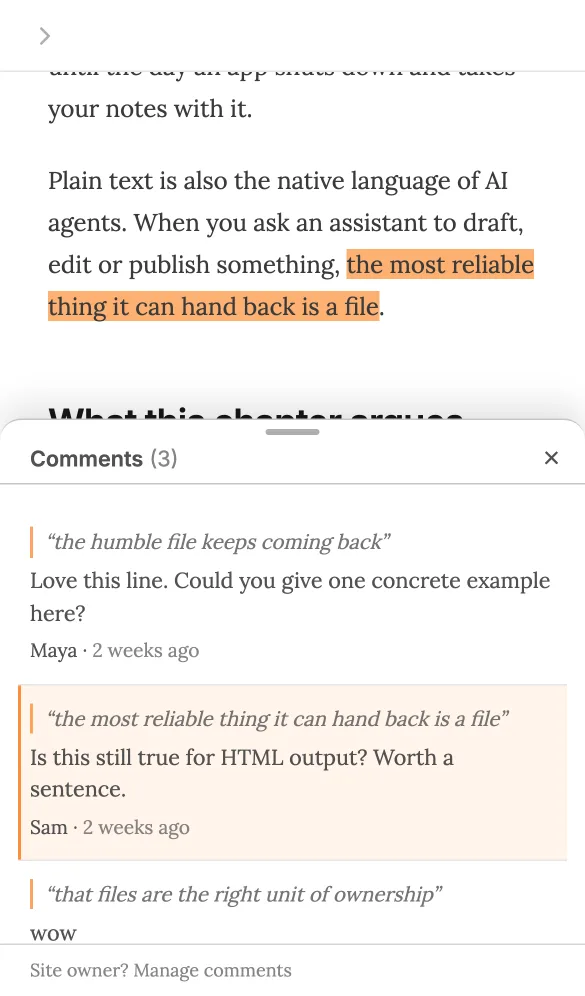
Pages open for feedback now say so in a bar at the top, comments sit beside the text instead of over it, and on phones they open in a sheet that keeps the passage in view.

We redesigned how reviewers comment on your drafts when annotations are on. Same feature, same fl annotations pull for your agent; it's now easier to notice and easier to read.
- A bar at the top. A slim bar under your site's navigation tells reviewers the page is open for comments, how many there are, and has a Show comments button. It replaces the small button in the bottom-left corner, which people missed.
- Comments beside the text, not over it. On wide screens the list docks on the right and the page makes room for it, so nothing you're reading is hidden. Click highlighted text to jump to its comment, or a comment's quote to jump to the passage.
- A bottom sheet on phones. Tap highlighted text and the comments open in a sheet over the lower half of the screen, with the page scrolled so the passage sits just above it. Writing a comment works with the keyboard open. Tap ✕ or swipe down to close.
- Lighter to write. Select text, click Comment, type and Post (⌘/Ctrl+Enter works). Your name is asked once and remembered.
- Tidier list. Comments are in page order with "2 days ago"-style times. Comments whose text you've since rewritten move to a collapsed Not found on page group, so they're not lost.
On the page these are now called comments; the setting, the annotations config key and the fl annotations commands keep their names. Try it on the demo draft, or see Annotations.
